Thoth 2.0 new user interface
Well, unified prefs are not the only thing on the list of improvements in Thoth 2.0 (though it was a big one as far as I am concerned). Brian also put a lot of effort on the windows for the Posts.
Here are Brian’s comments:
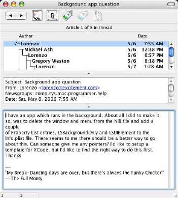
Anyway, I went and made a screenshot of what the Thoth 2 article window looks like.
Headers are in a separate pane, and the old show/hide details command is now show full headers/show selected headers, and determines what’s in the headers text pane. The pane and thread list are of course resizeable, the dimples in the window now make it clearer where you click to do the resizing.
One thought on “Thoth 2.0 new user interface”
Leave a Reply
You must be logged in to post a comment.
I wanted to apologize for the poor quality of the screen capture. I somewhat reduced the resolution and quality to limit file size to somethig that remains acceptable for even dial-up connections.
Maybe I should have used Flickr or something like that :-\ (or thumbnails).